
In the world of presentations, every detail counts, and the font you choose is no exception. As we enter 2024, the choice of font has become an integral part of presentation design, profoundly impacting how your message is received and perceived.
Fonts do more than just display text; they set the tone, convey emotion, and can significantly affect audience engagement and information retention. Whether you deliver a corporate report, a creative pitch, or an educational seminar, the right font can elevate your presentation from good to great.
Check out the example of an impactful presentation.
It is key to understand the psychology behind font choices and their impact on audience perception. Different fonts can evoke different feelings – a serif font might convey tradition and reliability, while a sans serif font often represents modernity and simplicity. But with countless fonts available, how do you choose the right one for your presentation?
In this blog, we will explore the “15 Best Fonts for Impactful Presentations in 2024,” covering a range of styles from professional and authoritative serif fonts to sleek and modern sans serifs, and even creative script and decorative options.
With using a Presentation design tool like CustomShow anyone can create amazing presentations using videos, images, and the range of available fonts. With using a Presentation design tool like CustomShow that is developed by React JS Development Services anyone can create amazing presentations using videos, images, and the range of available fonts.
Doesn’t matter whether you’re a seasoned presenter or just starting, CustomShow is easy to use and anyone can create amazing dynamic presentations with it.
The use of a presentation tool and a guide like this blog will help you make informed decisions about font selection, ensuring your presentations are not only visually appealing but also effective in communicating your message. If you’re short on time or need professional help to polish your slides, you can always do my powerpoint today with expert assistance and save hours on design and formatting.
Let’s dive into the world of typography and discover how the right font can transform your next presentation.
Read more on How to Prepare a Sales-Focused Research Presentation
The Psychology of Fonts:
Understanding the psychological impact of different fonts is crucial in tailoring the mood and message of your sales presentation. Fonts carry their personality and character; for instance, serif fonts like Times New Roman or Garamond are often perceived as traditional and reliable, making them suitable for formal or corporate presentations.
On the other hand, sans serif fonts like Helvetica or Arial exude a more modern and clean vibe, ideal for contemporary and straightforward presentations. Script fonts, while elegant and expressive, can inject a personal touch, suitable for creative or narrative-driven content.
The key lies in aligning the font’s inherent qualities with the tone and purpose of your great presentation, ensuring that the typography complements and enhances your message, rather than distracting from it.
Top 5 Serif Fonts for Presentations:
A. Overview of Serif Fonts:
Serif fonts, characterized by small lines or strokes attached to the end of larger strokes in letters, are often associated with professionalism, credibility, and tradition. These fonts are a staple in various presentation contexts, particularly suited for formal, academic, or corporate settings where clarity and authority are paramount.
The presence of serifs makes these fonts exceptionally legible in printed formats and detailed slides, making them a reliable choice for conveying important information with gravitas.
B. Top 5 Serif Fonts for 2024:
Each of these serif fonts brings a unique flavor to presentations, enabling presenters to align their visual style with their content and audience expectations. These top serif fonts of 2024 offer compelling choices for impactful presentations.
Times New Roman
A classic choice, Times New Roman remains a staple in the professional world. Its straightforward, no-nonsense appearance is perfect for financial reports, legal presentations, and academic lectures.
Garamond
Known for its elegant and timeless look, Garamond is ideal for presentations that require a touch of sophistication without sacrificing readability. It works well for literary topics, historical content, and high-end corporate presentations.
Georgia
Designed specifically for digital readability, Georgia is a versatile serif font that is equally effective on screen and in print. Its slightly rounded features and ample spacing make it a great choice for webinars and online presentations.
Baskerville
Offering a balance of sharpness and elegance, Baskerville works well for presentations that aim to impress and engage. Its professional demeanor is suited for high-level business presentations, academic conferences, and professional seminars.
Top 5 Sans Serif Fonts for Presentations
A. Exploring the Appeal of Sans Serif Fonts:
Sans serif fonts, known for their clean lines and absence of decorative strokes, have become increasingly popular in modern presentations.
Their simplicity and clarity make them ideal for digital screens, where legibility is paramount.
The minimalist design of sans serif fonts lends a contemporary and approachable feel, making them suitable for a wide range of presentation contexts, from tech startups to the top creative agencies.
B. Top 5 Sans Serif Fonts for 2024:
Each of these sans serif fonts offers a clean and modern aesthetic, ideal for a variety of contemporary presentation styles. These top sans serif fonts of 2024 can help enhance your message with style and clarity.
Arial
A widely used sans serif font, Arial is known for its versatility and readability. It’s a safe and professional choice for business presentations, especially when dealing with diverse and international audiences.
Helvetica
Renowned for its clean, crisp lines, Helvetica is a favorite for branding and marketing presentations. Its neutral yet appealing character makes it perfect for conveying modern professionalism.
Roboto
Designed specifically for digital readability, Roboto offers a harmonious balance between mechanical and geometric forms. This font is ideal for tech-focused presentations or any content meant to be consumed on digital platforms.
Calibri
As a default font in many applications, Calibri is familiar and comfortable for most audiences. Its soft, rounded curves are suitable for both corporate and casual presentations, making it a versatile choice.
Open Sans
Known for its friendly and legible appearance, Open Sans works well in both print and digital formats. It’s particularly effective for educational content, webinars, and instructional presentations, where clarity is crucial.
Top 5 Script and Decorative Fonts for Creative Presentations
A. When and How to Use Script and Decorative Fonts Effectively:
Script and decorative fonts are perfect for adding a unique flair and personality to your presentations, especially in creative or less formal contexts. As an SEO consultant, I find these fonts work best for titles, headers, or special emphasis, where their elaborated poster design adds impact without being overwhelming if used sparingly.
The key is to use them sparingly and balance them with more straightforward fonts for body text. They are ideal for presentations in the arts, fashion, entertainment sectors, or digital signage, where visual impact is as crucial as the content itself. Remember, the goal is to enhance your presentation’s aesthetic appeal without sacrificing readability.
B. Showcasing the Top 5 Script and Decorative Fonts for 2024:
These top script and decorative fonts for 2024 can add a distinctive character to your presentations, making them memorable and engaging. While they offer creative freedom, it’s crucial to balance their decorative nature with the functional aspects of your presentation.
Lobster

Known for its playful and bold style, Lobster is perfect for titles and headings, giving your presentation a touch of modern elegance.
Pacifico

Pacifico offers a relaxed and friendly vibe, ideal for casual or creative presentations where a personal touch is desired.
Great Vibes
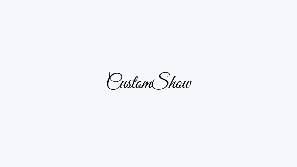
This elegant script font adds a sophisticated flair to any presentation, suitable for wedding planners, fashion brands, or upscale events. It is also perfect for designing custom wedding invitations, giving them a refined and timeless touch that will impress guests.
Dancing Script
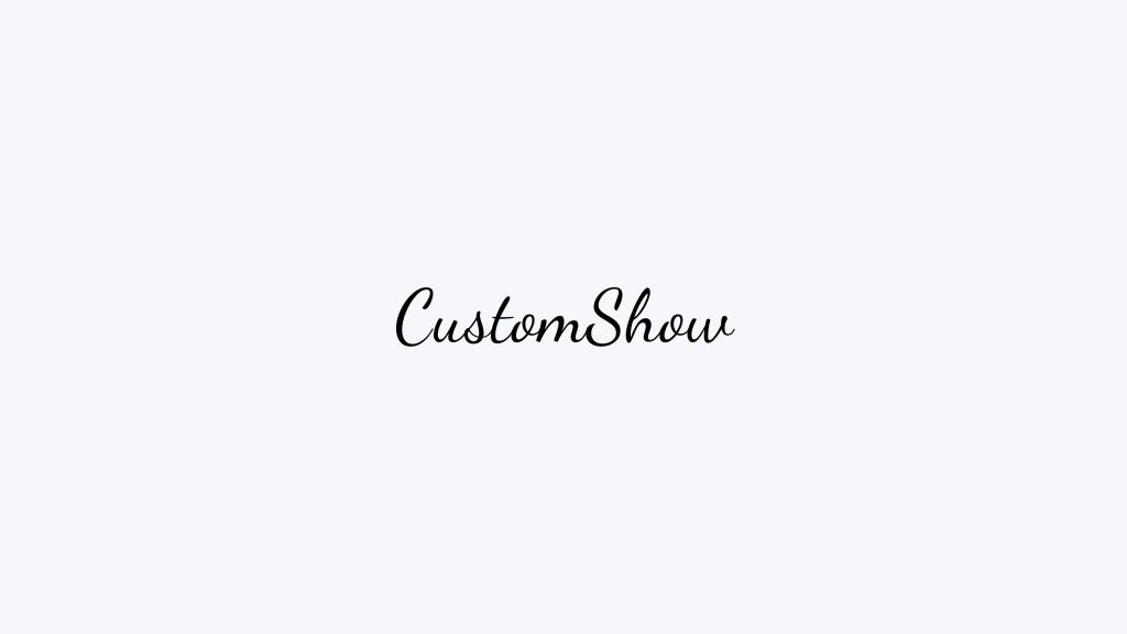
As the name suggests, Dancing Script brings a dynamic and lively feel to your slides, great for engaging and informal presentations.
Brusher

A bold and contemporary brush script, Brusher is ideal for making a statement in creative and artistic presentations.
Accessibility and Readability
The accessibility and readability of fonts cannot be overstated. Selecting fonts that are easily legible is crucial not only for effective communication but also for inclusivity, ensuring that your content is accessible to all audience members, including those with visual impairments.
A key tip is to opt for fonts with clear, distinct characters, such as Arial or Calibri, and avoid overly stylized fonts that might cause readability issues.
Additionally, consider the size and color contrast of your text against backgrounds; higher contrast and larger font sizes significantly enhance readability.
Prioritizing these aspects in your font selection makes your dynamic presentation more user-friendly, ensuring that your message is conveyed clearly and effectively to every member of your audience.
Font Pairing Strategies
Effective font pairing is an art that can significantly enhance the aesthetic appeal and clarity of your presentation.
A best practice is to combine a serif font with a sans serif font, balancing tradition with modernity. For example, pairing a classic serif like Times New Roman for headings with a clean sans serif like Arial for body text can create a visually appealing and readable layout.
Another strategy is to use two different weights or styles of the same font family, which provides visual variety while maintaining cohesion.
Remember, the key to successful font pairing is contrast and harmony; the fonts should be distinct enough to create interest but similar enough to maintain a unified and professional look.
Read More How to Make Great Presentations That Engage Audiences
Tips for Customizing Fonts
Customizing fonts effectively can help build brand loyalty by elevating the uniqueness and brand alignment of your presentation. To achieve this, consider modifying font styles to match your brand’s personality. Here are the best 5 tips for customizing your fonts:
Align Font with Brand Personality: Choose a font that reflects your brand’s character. For a modern brand, go for a clean sans serif; for a traditional feel, opt for a classic serif.
Experiment with Font Weight and Size: Adjust the weight (bold, regular, light) and size of your font for emphasis and hierarchy within your presentation content.
Use Brand Colors: Customize your font color to match your brand’s palette, enhancing brand recognition and visual appeal.
Create Contrast for Emphasis: Pair contrasting fonts (like a bold headline with a light body text) to draw attention and create visual interest.
Leverage Typography Tools: Utilize tools like Adobe Fonts, Fontsz or Canva for advanced customizations, such as letter spacing, line height, and creating unique font styles.
Common Font Selection Mistakes to Avoid
When selecting fonts for presentations, a common pitfall to avoid is choosing style over legibility. Fonts that are overly decorative or stylized can detract from the clarity of your message, making it difficult for the audience to quickly process information.
Another frequent mistake is using too many different fonts, which can create a disjointed and unprofessional look. Ideally, stick to a maximum of two to three complementary fonts.
Additionally, avoid underestimating the importance of font size; too small fonts can be challenging to read, especially in larger rooms or on smaller screens.
Read More How to Hand Over a Presentation to the Next Person
Conclusion
The choice of font in your presentations can significantly influence the effectiveness of your message. From the psychology behind serif and sans serif fonts to the importance of readability and accessibility, each aspect plays a crucial role in how your content is perceived and received. Take a look at how CustomShow could help in your presentations.
Discover how to elevate your boring presentations
Check out CustomShow sample presentation that keeps your audience in awe.
Simply upload your existing PPTx and take your presentation from Static to Stunning.Create your dynamic presentation for free, and sign up on CustomShow.