
The presentation of data is not as easy as people think. There is an art to taking data and creating a story out of it that fulfills the purpose of the presentation. We’ve seen 100’s of presentations and we’ve developed our own best practices when presenting data to any audience. Some of these insights are fairly straightforward while others are less obvious. But overall, these tips should allow you to better organize, visualize, and verbalize your presentations with success and ease.
Reduce Text & Create More Visuals
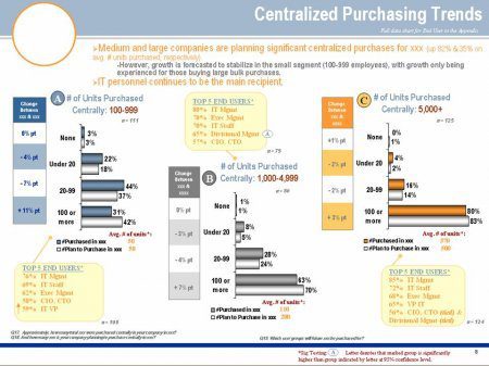
Many case when we’re presenting big data sets, we think that having plenty of text on the graphs can be a good thing because it helps explain the graph a little better. This is in fact a bad idea because it makes the graph look more jumbled and does not present well as people try to take in the visual nature of the data set that is being presented. More texts in graphs don’t look good. For your presentation, you need clear graphics with fewer texts and, for that, an experienced writer or help to write presentation texts. Here is an example of a presentation with plenty of data but too much text.
 Lines, Bars, Pies….Choose What Makes Sense
This is something that must be well thought out. Line graphs, bar graphs, and pie graphs do matter depending on the context and the message you’re looking to portray to your audience. Line graphs are great for time based data presentations. Bars are great for groupings. Pies are perfect for percentages of things. Knowing which type of graph makes the most sense can help in presenting the data to your audience.
Consolidate Data
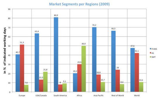
There are times when we present data and we don’t take advantage of consolidating multiple graphs into one graph. A great example is looking at the growth in search engine marketing across multiple device platforms including desktop, tablet, and mobile. One could create 3 separate graphs showcasing the growth in search engine marketing via 3 separate bar graphs, but combing them into 1 graph creates a more powerful image for the audience. In the graph below, this could have been broken out into three separate graphs, but the presenter decided to consolidate into one graph.
Create Simplicity In Your Data
Try not to make the data look too complicated. In the previous section we discussed consolidating data but there are cases when too much consolidation can be too complex for the eyes of the audience to consume. Remember that your audience has the arduous task of going back and forth between you and the graphs you’re speaking to. Constructing the graphs as simple as you can make them will make it easier for your audience to grasp your message.
Place labels close to data points
Data legends and labels are often absent. The presenter assumes that the audience will follow their verbal cues. Or, when legends and labels are present, they are often presented far away from associated data points. This forces the audience to visually scan back and forth. When you are creating a legend, place the points close together in the corner upper right or bottom right of the graph. This way, the audience can easy view the points and scan back to the graph as you’re speaking to it.
Leverage Video For Data Presentations
Video is our friend. It engages people, mixes up the visuals, and helps portray a message and tell a story. After a particular data set, don’t be afraid to throw in a video that helps augment the purpose or reasoning behind the data.
Explain the data axes
You may think this is simple and people will automatically get it but explaining the axis before any presentation is nonetheless important. All it should take you is 5 – 15 seconds to give a basic understanding of what the axes mean.
Don’t Be Afraid To Dig A little deep into numbers
Without being complicated, don’t be shy in explaining the numbers. Talking numbers is never fun for an audience but if there are ways to incorporate the graph and data into a story that serves purpose and meaning to the presentation, work to do it. You can never assume the audience fully understands what you are saying or conveying so digging deep into the numbers can be critical to getting your message home.
Find Brand Consistency In Your Data
Don’t be afraid to use more brand consistency and color schemes in your data sets. It’s nice to portray your brand and doing so with similar colors and text helps augment your brand from the beginning to end of the presentation.
Answer the “Why?” questions
When you’re presenting data, the audience always wants to know why. Why is this important, why does this matter, and why should I care. Answering the why in your data helps you understand your purpose and the true meaning behind the numbers.
With every good presentation is a good presentation builder that fit the intricacies and identity of your organization. At CustomShow, we believe our presentation software can do just that. View the power of CustomShow in the video below.